
Coastal Without the Cliché
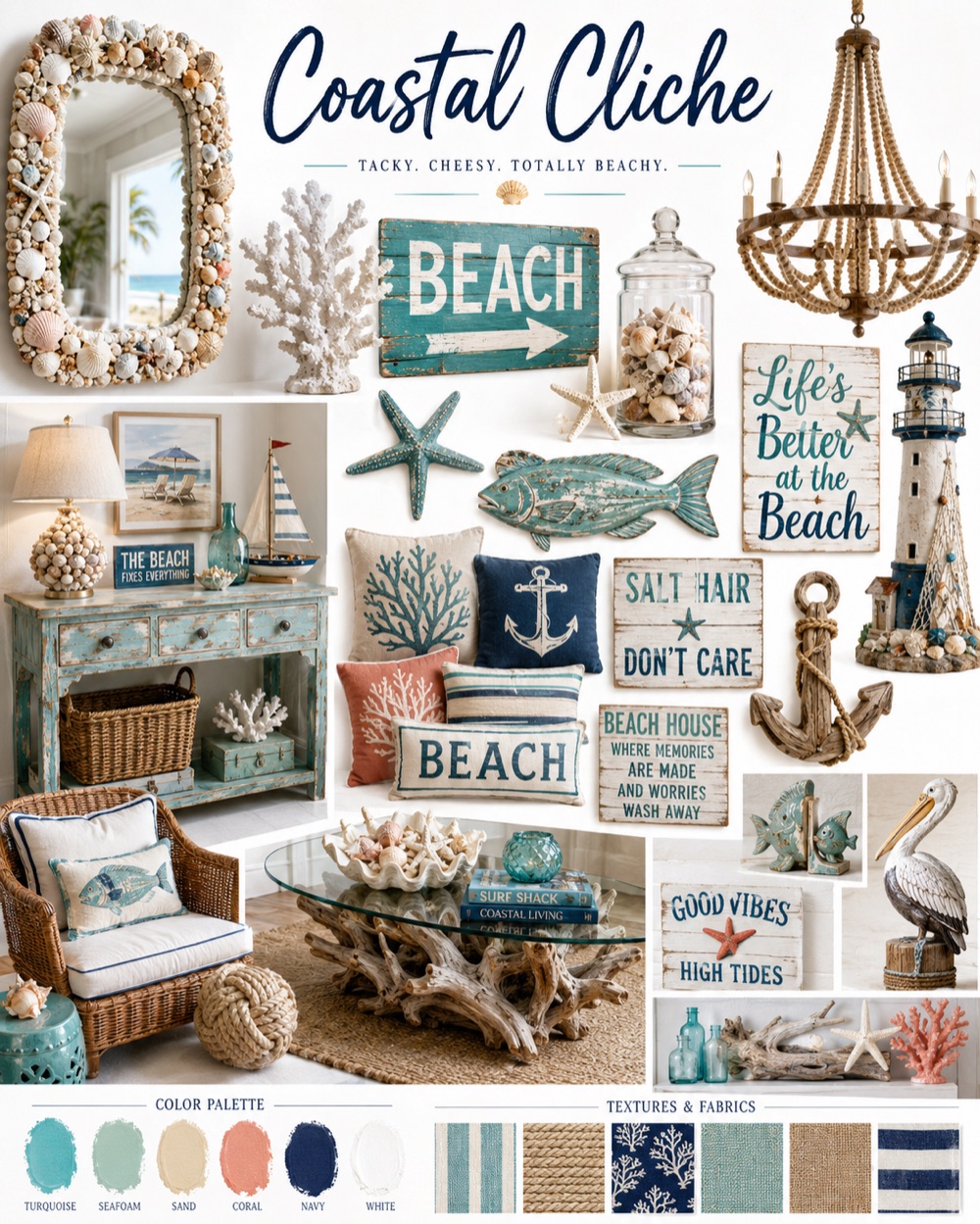
We’ve all stayed at a beach rental where the owners went to town on what they probably thought was clever beach décor. Lamps filled with seashells, weathered signage informing you that you’re at the beach, or pastel colored sea horse and coral hooks in the bathrooms. Unfortunately, such obvious themes are tiresome and lazy.
In achieving coastal décor without the cliché accessories, think about the elements of the beach in their natural state. You don’t need to bring the actual sand, seashells and driftwood into your design to create a casual, relaxed mood. You simply need to bring in the colors and textures that will create the coastal vibe in a much more subtle way.
Instead of choosing obvious beach accessories like the ones shown up top, include layered textures that will mimic the roughness of the sand and smoothness of the sea. And, of course, we’ll include some natural plants that pull in some of the lush greens found in the dunes.
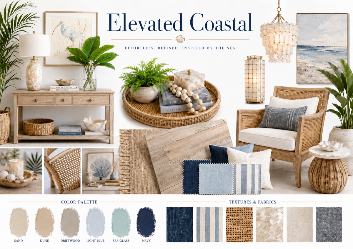
Grounding the room, I’ve chosen a medium wood floor that has a distressed look with darker grains.
This wood reminds me of a piece of driftwood and will blend nicely with a wide range of furniture. In my own home, I have a similar flooring with mostly light furniture. However, I do have a few cherished antique pieces in more of the walnut color. Flooring with a variation in the grain is what unifies the space.
An area rug will add to the light and airy feel of the room and bring in some of those coarse fibers that mimic the sandy dunes and natural fibers found in coastal vegetation.
Now, the fun part. Picking out some accessories that provide our coastal feel without being so obvious and screaming, “beach.”
The pillows and throw continue to pull in some of those subtle pops of blue and teal, and repeat the use of our natural colors from the walls and area rug.
Our other accessories include some baskets, table lamps and a natural fiber poof. Note that the baskets are a lighter color weave than the jute area rug.
This is intentional to achieve the layering look and keep it natural looking. In nature, you’ll find that raw materials are rarely uniform in color. Bringing in other hues and shades adds dimension and richness to the room. One of the table lamps has a bit of a sheen to it, similar to a seashell. The other has the look of aged driftwood. The vase adds some of the rich teal tones found in the sea. Both appropriately bring in textures that you’d find on the coast without bringing the actual beach into your living room.
Finally, we’ll add some real plants to bring in some of the green tones found in the sea and the dunes. It’s ideal to mix the hues a bit, as the more variation you have, the more it will reflect what you see in nature.
When I work with clients, I’ll create vision boards that combine all the images you see here. When clients see the paint colors, fabrics, finishes and textures in one place, it helps them visualize the finished space. Final selections are never exactly what’s on the vision board. We simply use the vision boards to stay on track when sourcing selections. Whether you use a PowerPoint deck or Pinterest, use a vision board for your next project and it will help you stay focused and make appropriate choices.